教程:如何在 Optuna-Dashboard 中绘制图表
在本教程中,我们将解释如何在 Optuna-Dashboard 中显示图表。
optuna_dashboard.save_plotly_graph_object 可用于在 Optuna-Dashboard 中集成和显示由 Optunahub 模块生成的图表。
准备工作
首先,通过执行以下命令确保安装了必要的软件包
$ pip install optuna optunahub optuna-dashboard
示例
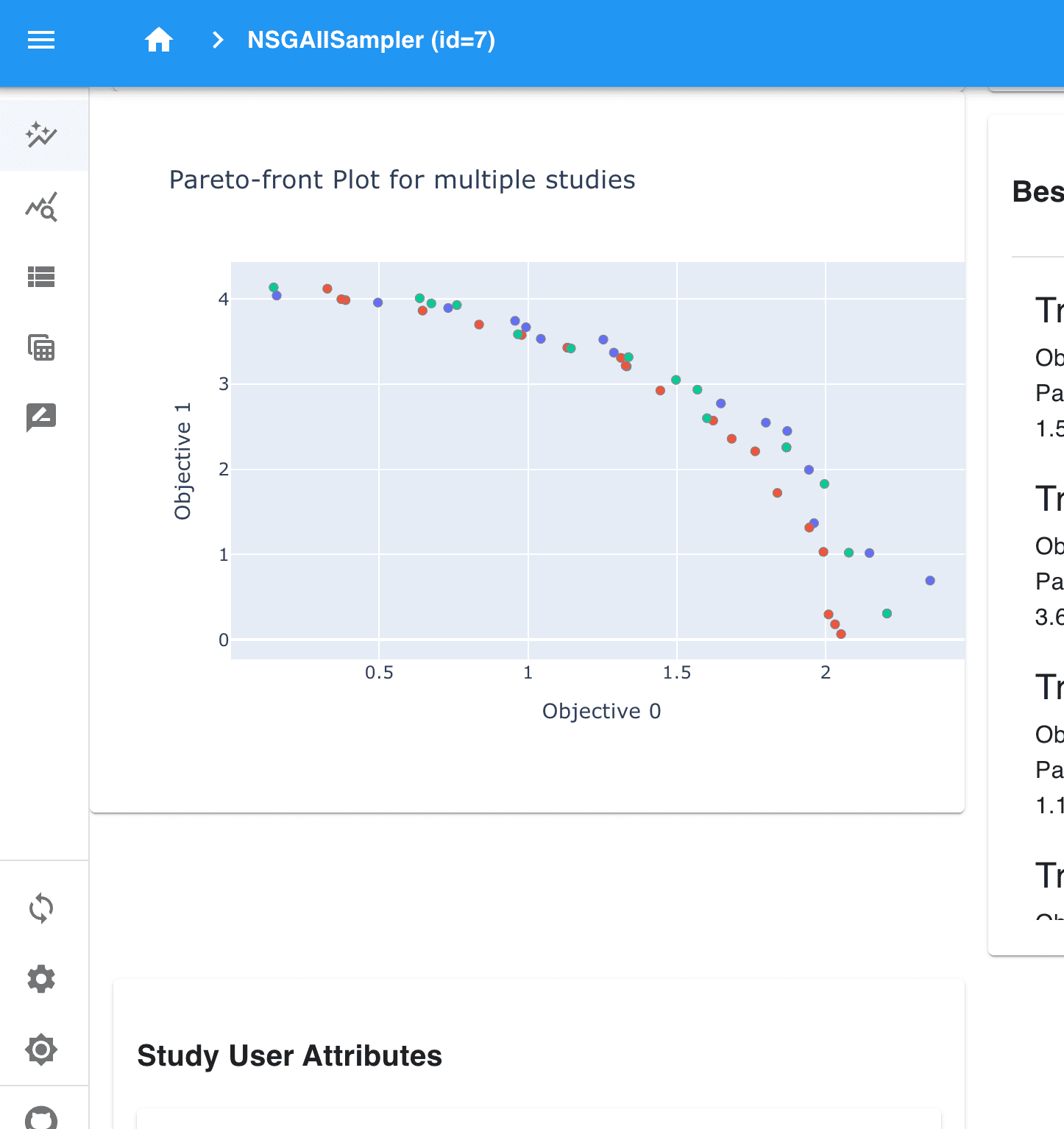
为了说明一个示例,我们使用 WFG 问题集 和 绘制多个研究的帕累托前沿。
import optuna
import optunahub
from optuna_dashboard import save_plotly_graph_object

wfg = optunahub.load_module("benchmarks/wfg")
wfg4 = wfg.Problem(function_id=4, n_objectives=2, dimension=3, k=1)

samplers = [
    optuna.samplers.RandomSampler(),
    optuna.samplers.TPESampler(),
    optuna.samplers.NSGAIISampler(),
]
studies = []

for sampler in samplers:
    study = optuna.create_study(
        sampler=sampler,
        study_name=sampler.__class__.__name__,
        directions=wfg4.directions,
        storage="sqlite:///db.sqlite3",
    )
    study.optimize(wfg4, n_trials=100)
    studies.append(study)

m = optunahub.load_module(
    "visualization/plot_pareto_front_multi"
)
fig = m.plot_pareto_front(studies)

for study in studies:
    save_plotly_graph_object(study, fig)
运行此代码后,通过以下命令启动 Optuna-Dashboard
$ optuna-dashboard sqlite:///db.sqlite3
然后,转到其中一个研究页面。您可以在仪表板中看到图表,如下图所示。